Designing for conversion
Our creative process starts with research, getting to know the organisations’ brand and doing an audience analysis. Then our creatives proceed with ideation and deliver a ‘mood board’ to present rough ideas.
From those rough ideas our team applies best practices we’ve learned from many years of testing and optimising.
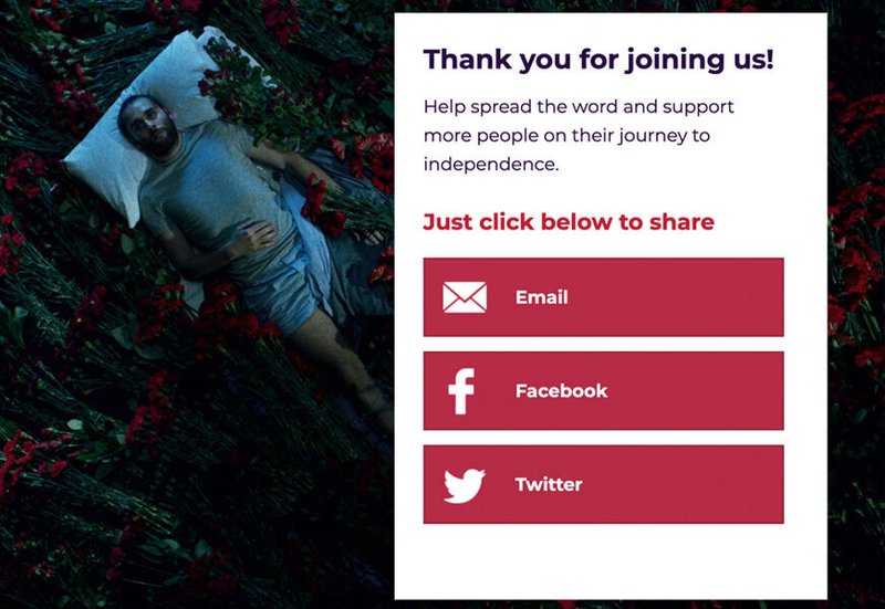
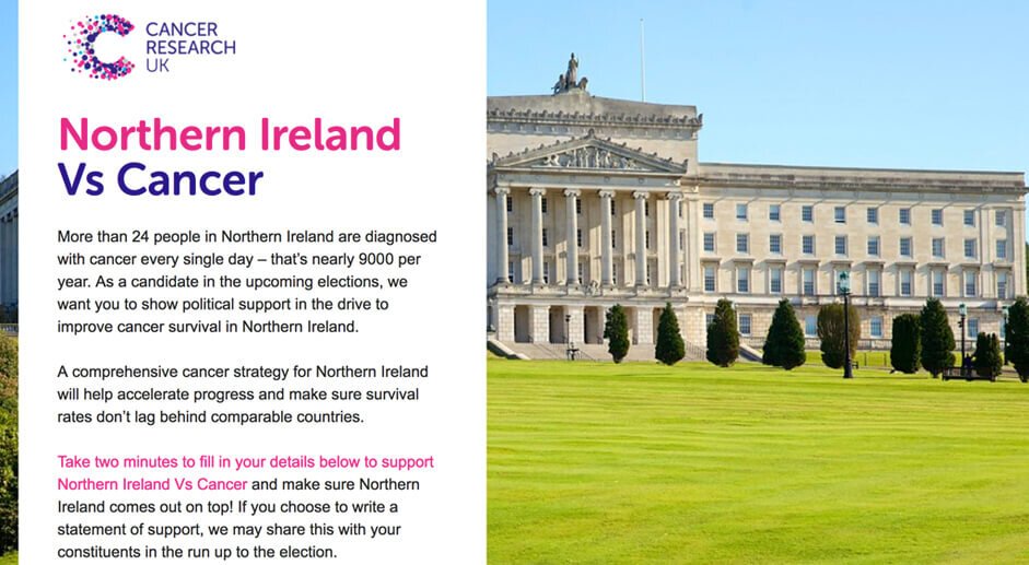
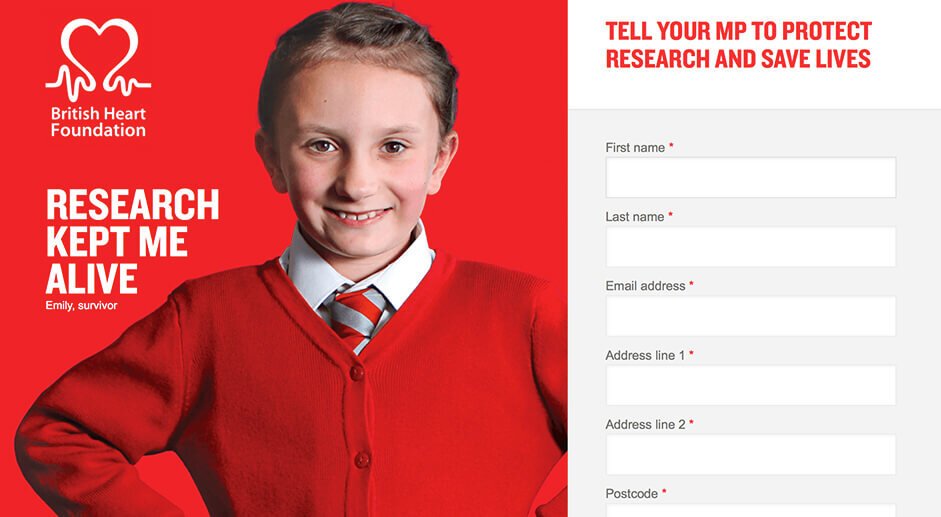
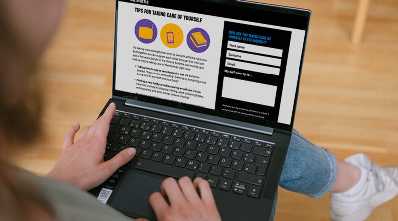
Our action page and landing page designs strive to be simple and intuitive yet striking and engaging. We reduce the content on the page and its visual elements to the bare minimum to ensure users can really focus on taking the action.
Mobile first
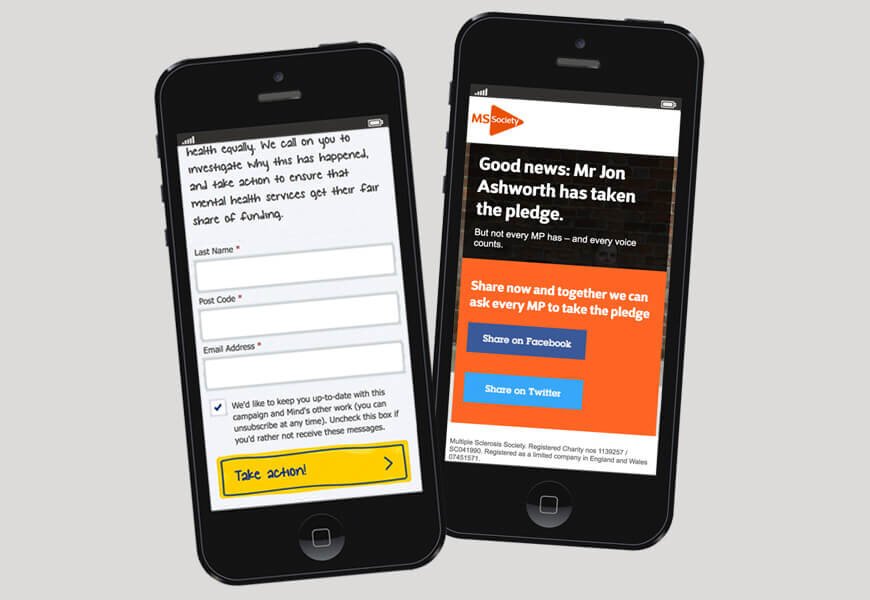
All designs we produce are designed from the ground up to work on mobile devices. The reason is obvious: most organisations get more traffic from mobile to their landing pages than desktop users.
Designing for mobile also means creating solutions that work in an environment where the user might be easily distracted. Our approach is to strive for simplicity rather than creative designs that might be overwhelming or would take a long time to load on mobile devices.

Form design
A central element of high converting landing pages is good form design. Our team has extensive experience in making complex form interactions simple and easy to complete.
Our form fields are big enough so they are easy to tap on mobile screens, the form labels are always clear and visible.
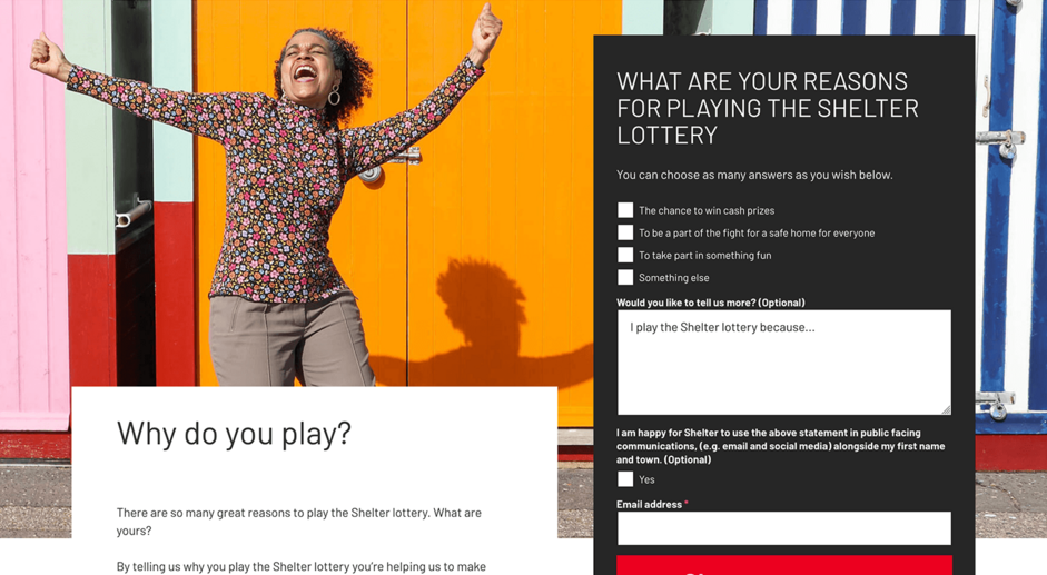
Long forms are often broken down into smaller steps to reduce the cognitive load of the user. If possible we only present one choice or ask simple ‘yes / no’ questions and then follow up with a tailored user experience or journey.

Social Proof
One of the central ideas behind public campaigning is to use people power to gain influence. Social proof is a way of showing that many people have already taken action and that you as a user should join them.
Over the years we have used a range of different methods to convince users to take action and to opt-in to email lists.
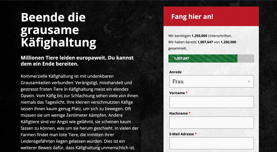
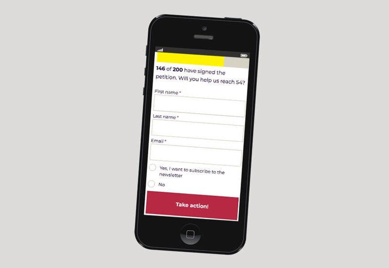
A typicalprogress bar or counter can be used to show how many people have taken action so far and what the goal is in terms of signers.
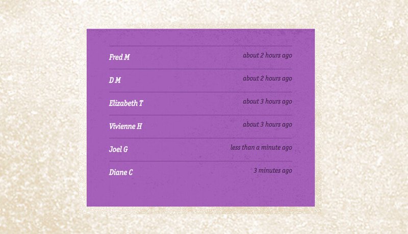
A live ticker on the page can increase the sense of urgency and make an action feel more active, which can increase conversion rates.
Split testing & optimisation
When designing and building pages we also offer to conduct split tests for a few actions to ensure the design and content can be constantly improved.
Our team has helped organisations raise their conversion rates on action pages from 30% to over 70%. Through split testing and heat map analysis we can identify usability problems and fix them.
