Designing for donor conversion
Our creative process starts with research, getting to know the organisations’ brand and doing an audience analysis. Then our creatives proceed with ideation and deliver a ‘mood board’ to present rough ideas.
From those rough ideas our team applies best practice design and development learned from many years of testing and optimising.
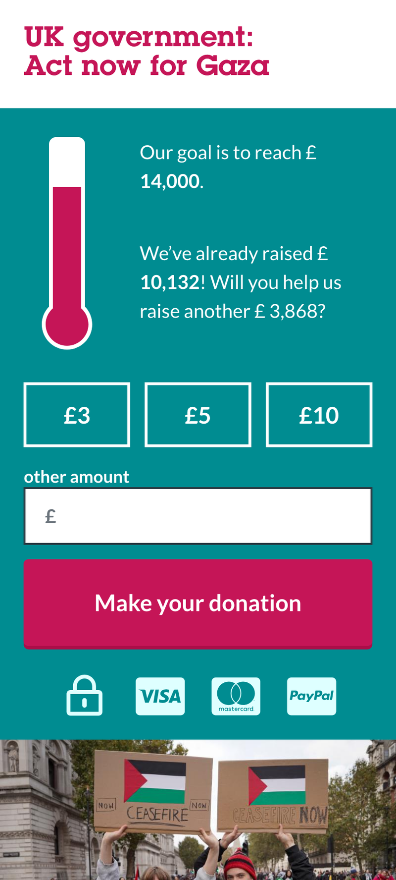
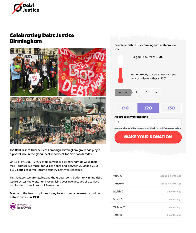
Our donation page designs strive to be simple and intuitive yet striking and engaging. We reduce the content on the page and its visual elements to the bare minimum to ensure users can really focus on giving.
More Onion came up with very good designs straight away, that followed our brand guidelines perfectly, and quickly developed them into working prototypes that I was able to feedback on. We've had really good results with the new responsive forms, which included extras like progress bars, postcode lookup, and social sharing. The support is great too - very quick and everything is logged. I'd happily work with them again.
Mobile first approach to donation page design
All designs we produce are designed from the ground up to work on mobile devices. The reason is obvious: most organisations get more traffic from mobile to their landing pages than desktop users.
Designing for mobile also means creating solutions that work in an environment where the user might be easily distracted. Our approach is to strive for simplicity rather than complicated designs that might be overwhelming or would take a long time to load on mobile devices.

Donation form design
A central element of high converting donation pages is good form design. Our team has extensive experience in making complex form interactions simple and easy to complete.
Our form fields are big enough so they are easy to tap on mobile screens, the form labels are always clear and visible.
Long forms are often broken down into smaller steps to reduce the cognitive load of the user. If possible we only present one choice or ask simple ‘yes / no’ questions and then follow up with a tailored user experience or journey.
The actual payment process is also on a separate step to ensure the user can focus entirely on this interaction. Some payment providers such as Paypal will redirect the user to complete a payment and the user should not be surprised when it happens. Clear form steps help to establish what will happen next.
One of the central ideas behind fundraising is to show that many individuals can make a huge impact when making a small donation. Social proof is a way of showing that many people have already contributed and that you as a user should join them.
Over the years we have used a range of different methods to convince users to make a donation.
A typical “donation thermometer” or counter can be used to show how much money has been raised so far and what the goal is for this fundraiser.
A live ticker on the page can increase the sense of urgency and make the fundraiser feel more active, which can increase conversion rates.

When designing and building donation pages we also offer to conduct split tests for a few actions to ensure the design and content can be constantly improved.
Our team has helped organisations raise their conversion rates on donation pages from 1% to over 40%. Through split testing and heat map analysis we can identify usability problems and fix them.
We also analyse the different sources of traffic and implement tracking, to ensure you can attribute every donation to a specific measure you’re implemented.
Beyond the donation page
Moving to Impact Stack had a big impact on our digital fundraising. In particular, the simple, customisable forms and donation prompts on thank you pages meant we could develop a range of supporter actions and engagement campaigns to support our fundraising goals.
Our team frequently supports organisations with donor journeys and supporter journeys that include donation pages, but look at the entire experience from a strategic, integrated perspective.
Sometimes the problem is not just a donation page that needs optimising. Through a detailed analysis and by planning connected supporter journeys, from the first point of contact all the way to a regular donation, we can elevate your entire digital fundraising operation.
If you would like to find out more let us know - we'd love to talk!
